Alec Illustration

December 28, 2011

Ramen Music #8 Cover

Ramen Music issue #8 came out last week, and once again it has one of my illustrations on the cover.  You can listen to the entire issue for free, by following this link.  As usual, it is chock-full of all sorts of interesting new music, all wrapped up in a beautifully designed, interactive package.


For this image, I used an old idea that has been haunting my sketchbooks for years.  Originally the concept was to have a spiral of three-dimensional lettering floating above a birds-eye view of some sort of scene.  When I started sketching ideas for these Ramen Music covers, it occurred to me that I could have the piano keyboard spiral down, instead of lettering.  By extending the spiral endlessly, I'm hoping this image will hint at the infinite possibilities presented by the keys of a piano.

I still have one more Ramen Music cover which has not been used yet, so we'll see when they choose to break it out... hopefully some time in 2012!

December 21, 2011

Sketchbook XI

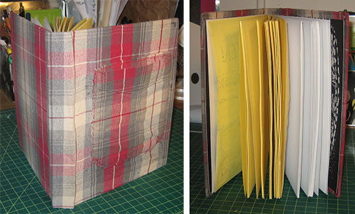
As many of you probably saw on my personal blog, I finished my first graphic novel last week.  This lined up almost perfectly with the end of the semester at CCS, and as luck would have it, I also finished off my tenth sketchbook yesterday.  Since I'm officially on Winter Break now, I spent today building a new sketchbook from scratch.


As you can see here, I covered it with an old flannel of mine that was starting to fall apart.  I cut out the pocket from the shirt and sewed it on the front to hold pens and scraps of paper.  I did the same thing with my 9th sketchbook.  If you are interested in making a sketchbook of your own, check out my Flickr set with step-by-step instructions and links to all of the tutorials I use.  It's really fun and imbues your sketchbook with a lot of personality.


Probably my favorite part of making a custom sketchbook is picking the paper.  I chose some yellow copy paper that I have had lying around forever.  The cheapness of the paper frees me from being too worried about the quality of work that goes on in here.  I believe sketchbooks are a place to experiment and have fun.  In the back I put some nicer drawing paper, which I will use for quick brush pen illustrations.  I often do final work right in my sketchbook, instead of on loose bristol.

Next week I'll get back to posting actual art... maybe something from these very pages!  Happy holidays everyone.


December 14, 2011

Not in Harry's Name! Chocolate Frog Card #5

For my last Chocolate Frog Card, I got to depict one of my all-time favorite scenes in the Harry Potter books, when Harry turns his back on the Minister of Magic and walks away.  It was the perfect moment for these cards, because Harry stands up to authority and fights for his rights.

This moment was also turned into one of my favorite songs, by one of my favorite bands, Harry and the Potters.  Check out track 9 on their album The Power of Love to hear this moment musically rendered.  Fingers crossed that they'll play this at the Yule Ball this weekend in Boston.  I will be there!


Remember, the Harry Potter Alliance is still selling their fair trade chocolate frogs, so order a box if you would like to get a collectable card with one of these illustrations on it.  The chocolates make great holiday gifts!

December 7, 2011

Not in Harry's Name! Chocolate Frog Card #4

For this week's Chocolate Frog Card I got to draw my favorite Harry Potter character, Albus Dumbledore.  I chose the scene from the end of book five for two reasons: 1) It is the only time in the books that Dumbledore faces off against Tom Riddle in a wizard's duel.  Of course Dumbledore is the stronger wizard and Riddle flees.  2) In an effort to shield Harry, Dumbledore also destroys the offensive statue in the lobby of the Ministry of Magic, which depicts wizards as being a superior race to elves and centaurs and goblins.


Next week I'll post my last illustration for these cards (one guess who it will feature!).  Don't forget you can still order The HPA's fair trade chocolate frogs from their shop.  They make a nice holiday gift, and you'll get one of these cards as well!

November 30, 2011

Not in Harry's Name! Chocolate Frog Card #3

This week's Chocolate Frog Card was the easiest one to design.  Hermione Granger's Society for the Promotion of Elfish Welfare (or S.P.E.W.) is a perfect parallel to the Not in Harry's Name campaign.  She stood up to authority, and tried to make the world a better place for others.


Claire and I ordered a box of The HPA's chocolate frogs and they arrived this week.  They were great!  Please consider buying a box to help support a good cause and try enact some social change.  You'll also get one of these illustrations printed on a collectable card!  (We got Dobby :)

November 23, 2011

Not in Harry's Name! Chocolate Frog Card #2

This week's Chocolate Frog Card features Ron Weasley.  I must admit, it was surprisingly hard coming up with a heroic moment for Ron...  Off the top of my head (and under serious deadline pressure) I couldn't think of a scene from the books where he stood up to authority.  Instead I decided on a moment where he had to face his fears to destroy the horcrux in Slytherin's locket.


Since last week, the Harry Potter Alliance added their fair trade Chocolate Frogs to the shop section of their site.  For $9 3/4 you get three chocolate frogs, one of the cards with my illustrations and more information about the Not in Harry's Name campaign.


November 16, 2011

Not in Harry's Name! Chocolate Frog Cards

I'm currently ten pages away from finishing my first graphic novel, Basewood.  I'm finding it very difficult to split my focus during this home stretch, so I thought I would take a break from creating new 100 Watercolor paintings for a few weeks, and instead share some recent illustration work I did for The Harry Potter Alliance.

A few years ago The HPA contacted me about a new campaign they were developing, called Not In Harry's Name, which has now gone live.  You can follow this link to read more about the campaign, but the basic gist is that Warner Brothers is using ethically reprehensible sources for the chocolate in their Harry Potter brand Chocolate Frogs.  One of the main messages of the Harry Potter books is basic human rights for everyone, so the HPA has been confronting Warner Brothers, trying to get them to change the source of their chocolate to a fair trade manufacturer.

Here is a web banner that I roughed out for the campaign back in 2009, when the idea was just getting started (click to see bigger).  This was never used, which is probably a good thing.  While I think it gets the idea across, it's a bit too cute for such a serious campaign.  I think the bold, dripping-chocolate design that is being used on the site works a lot better.


Warner Brothers has not complied with The HPA's wishes, even though The HPA's petition has already garnered 16,000 signatures of support.  So The HPA decided to create their own Chocolate Frogs, to prove to Warner Brothers that a product with certified fair trade chocolate could still be profitable.  As any Harry Potter fan knows, Chocolate Frogs usually come with collectible cards featuring famous witches and wizards - which is where I come in!

A few weeks ago, the HPA contacted me to see if they could use some of my existing Harry Potter illustrations on the cards, or if I had time to create some new ones.  Honestly, I didn't really have time to make new ones, but I dug deep and made time to create some.  These are the kind of illustration jobs that I cherish because I get to draw something I love and it allows me to use my illustration skills to help a great organization enact social change.

Using pre-existing images of Harry Potter characters in random scenes seemed to me like a missed opportunity.  Instead, I decided to depict a few main characters in key moments from the books, when they had to be brave and stand up against injustice, or face off against great evil.  That way, when someone buys one of the HPA Chocolate Frogs they will be reminded of the parallel theme from the Harry Potter stories, which is the whole idea behind The HPA.  The first idea that popped into my head was the newly-freed house elf, Dobby, blasting his previous master, Lucius Malfoy.


I made four other illustrations for the HPA Chocolate Frog cards, so I will post one a week, which should buy me enough time to finish off Basewood.  In the meantime, please check out the campaign, and consider signing the petition.  I couldn't find a link for buying these HPA Chocolate Frogs, but if I do, I'll post it here!

November 9, 2011

100 Watercolors #20 - Fortitude

I'm not going to lie to you guys - I had to look up "fortitude" in the dictionary before I could start sketching ideas out for this theme.  My iMac's built-in dictionary gives the following definition:  "Courage in pain or adversity."  Using that as a starting point, I came up with this illustration:


I used to skateboard when I was a kid, but I was never good enough to attempt a halfpipe.  If I ever had, I'm sure I would have ended up like this poor fellow here, though I'm not sure I'd have the fortitude to give it a second try!  ;)

Next week's theme: Vacation!

November 2, 2011

100 Watercolors #19 - Gray

Back in 2003 I was at the Burke Museum in Seattle when I saw four men sitting in the museum's cafe. From left to right, each man was a bit older than the next.  It was like a living, three-dimensional comic!  Here is the sketch I made later that night, to try and remember the moment:


When I started sketching out ideas for this week's theme, that old sketch popped into my head, and I decided to try and modify it for my illustration.  Here's what I came up with:


I thought a lot about the colors in this one - to try and pass at least one element from each character to the next, to reinforce the sequence.  Also at the last minute I decided to leave out a background.  I felt like the characters got the idea across just fine on their own.

Next week's theme: Fortitude!

October 26, 2011

100 Watercolors #18 - Rainbow


I had a much lamer idea for this theme, but as soon as I started sketching it out, the above idea jumped into my head, which was A LOT more fun!

If you can believe it, this is my 45th post this year.  That's only noteworthy because it makes this my most bloggingest year so far!  If you check the sidebar of this site, you'll see that in 2008 when I started this blog, I tried to post once every week, but I only made it to 44 posts.  This time hopefully I'll make it through the rest of this year and beyond!

I did some very tight-deadline illustration work for the Harry Potter Alliance last week which I'll share with you all in November, and it looks like Ramen Music will be using another one of my album covers in December, so I'll also have that to share.  In the meantime, I'll continue posting more of these 100 Watercolors images.  Onwards!

October 19, 2011

100 Watercolors #17 - Blood


This week's theme is well-timed for the month of October.  I think this is about as close as I will get to posting a halloween image, even though it's another dozen days until the official holiday.   Claire is making me some wizard robes for my costume this year.  I'm going to be Dumbledore, since this will be my last halloween with an insanely long beard.

Next week's theme: Rainbow!

October 12, 2011

Paul and Alison Wedding Photo Watercolor

Okay, I thought this week I would take a break from the 100 Watercolors challenge to show you guys a commission I painted for some friends of mine this summer.  Those of you who are familiar with my Phase 7 comics will no doubt remember my friend Paul who loaned me his copy of Understanding Comics, thus changing my life forever.  Well, Paul wrote me this summer to see if I could repaint one of his wedding photos as a watercolor, for his wife as an anniversary present.

Here is the original photo of Paul, his wife Alison and their dog James:


And here is the watercolor that I made, based on the photo.


Obviously, I pumped up the colors a lot for this, but I also played with reality a bit and turned James's head and got rid of his harness, to make things a bit more picturesque.  This was a lot of fun to work on because Paul and Alison are great friends!

Next week's theme (for real this time): Blood!

October 5, 2011

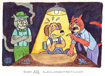
100 watercolors #16 - Questioning


The first thing that came to mind for this theme was one of those classic "good cop, bad cop" questioning scenes from any number of police movies or TV shows.  But then I thought it might be funny to do good and bad CAT, instead!  As I have already shown in this series, I am more of a dog person than a cat person, so I tried to make these cats seem pretty mean.  Sorry cat lovers... maybe I'll be able to redeem myself in future watercolors.

I had a really good time mixing the colors for this one.  I'm starting to see the wisdom in some of those old art school tips like 1) never use a color straight from the tube - ALWAYS mix it with at least one other color! and 2) don't just use black, MIX black (in this case with a dark brown and deep blue).

I've been chipping away at many of the future themes.  I've got the next seven all penciled out and dozens more of the concepts figured out.  It's hard to believe I'm still only 16% done with this.  Oh well, I'm having fun and learning a lot, so I guess it's all going well.  Hopefully these are enjoyable for you as well.

Next week's theme: Blood

September 28, 2011

100 Watercolors #15 - Silence


For this theme, I figured the only thing quieter than space, is a MIME in space!  I had a good time layering a bunch of colors to get a nice rich space backdrop.  I used a dark green, then a dark blue and then a layer of black over the top.  I also used some masking fluid to make sure the star areas stayed white while I was putting in all those dark colors.  Then I hit them with a little blue to push them back, so the pure white on the characters would pop a little more.  This one was fun!

Next week's theme: Questioning

September 21, 2011

100 Watercolors #14: Smile


This week's theme is Smile.  As I was sketching out various ideas, I remembered one of the most touching smiles I have ever seen.  I went to Oberlin College and during my first year there I had a few classes with this one girl who always seemed very bummed out.  She always looked like she was on the verge of tears.    Over the next four years I would see her occasionally in classes or around campus, and it was always the same; she seemed so sad and downcast.  Then, magically a few weeks before the end of my senior year, I saw her walking across Tappan Square holding a bunch of red roses and smiling quietly to herself.  It was the last time I ever saw her, and it was so wonderful to see her finally smile.

Above is my clumsy attempt to illustrate that moment!  I'm pretty happy with how the grass and trees turned out in this one.  I feel like I'm getting better with layering different hues, and not overworking stuff!

Next week's theme: Silence!

September 14, 2011

100 Watercolors #13: Misfortune


Dropping your ice cream cone as a kid was the most misfortunate thing I could think of for this theme.  I tried to have some fun with the composition with this one, so that the ice cream on the pavement is the last thing you see.  Of course, only after I finished it could I see that there are WAY too many yellow dashes in the middle of the road.  I might as well have made it a solid yellow line!  Oh well, I guess my hopes of a perfect painting were dashed in the street...  (Pun intended!)

Next week's theme: Smile!

September 7, 2011

100 Watercolors #12: Insanity


I'm not sure this one 100% makes sense, but when I was brainstorming ideas for this theme, sitting in an office 40 hours a week felt like one of the craziest things to me.  But society views a steady office job as probably THE most sane thing, so I thought I would jumble them together.  I kind of like the idea of this guy punching in every morning right at 9am and sitting there all day.

Next week's theme: Misfortune!

August 31, 2011

100 Watercolors #11: Memory


This week's theme is Memory.  Even though this image is kind of sad, I still had a really fun time painting it.  One of the watercolor tips Claire gave me is that if you're filling in a big area (like the blue sky background here) you should wet the area down first with clean water.  That way it's easier to spread the color around and mix it with other colors while it's still wet.  I'm pretty happy with how this one turned out, though I think I overworked the tree a little bit.  Live and learn!

Next week's theme: Insanity!

August 24, 2011

100 Watercolors #10: Breath Again


This week's theme is "Breathe Again."  Those words made me think of being trapped at a party where everyone is smoking, and the wonderful feeling of being able to breathe again after you have left.  This happened to me a few times in college (somehow, both of the girls I dated in college smoked - blech).  While drawing this, I was thinking about those ol' college days, so I made the protagonist in this drawing my best friend from college, Gabe, who is the most outspoken anti-smoking person I have ever met.

Next week's theme: Memory!

August 17, 2011

Watercolor Warm-ups

Hey, does anyone remember my 100 Watercolors Challenge?  I won't blame you if you don't!  It's been almost THREE years since I last posted a painting.  That doesn't mean I haven't been working on it though!  For this past year, I have been secretly chipping away at some of the preparatory work for the project: brainstorming visual ideas for the different 100 themes, penciling them out, transferring them to watercolor paper, etc. etc. etc.

I have also been getting mentally ready to paint watercolors again.  Last October, my girlfriend Claire Sanders moved in with me, and she is a watercolor wizard!  Here's an example of an awesome watercolor present she made for our friend Liz.  It's a reimagining of the Monster Bash pinball machine's backglass, but with all cats, because Liz's cats are named Dracula and Wolfman, remember?


Talented, no?  Yes!  So much so, that soon after she moved in, I asked Claire to collaborate with me on my yearly blog archive image.  We did it as a watercolor, so I could learn some of her tricks.  This was the first time I had used watercolors in a long time, but with Claire's help I already felt like I took a step forward with the process.


Then, in May, Claire and I headed up to Montréal for a 24-Hour Comics event, and again, I asked her to collaborate with me.  I did all of the drawings on watercolor paper and Claire colored them all.  It was a crazy eighteen hours of work, but when we were done, we had a pretty cool 24-page comic, and I had learned a TON about watercolors, from working side by side with Claire.  You can read the whole comic over on Grandpapier and here's the cover image to give you some idea of how it turned out:


So!  With all of these warm-ups done, I feel like I'm ready to dive back in on the 100 Watercolors challenge.  Starting next week, I will be posting one painting a week, unless I have some other exciting illustration stuff to share.  As I stated at the beginning of this project, my main goal here is to get better at watercolors, so hopefully by painting the remaining NINETY-ONE themes I will accomplish that goal!

August 11, 2011

Weezer Icons: Hurley

Today I am posting the last batch of Weezer Icons which covers Weezer's latest studio album, Hurley.  There are also a few bonus icons.  Descriptions below!


In comics order:  1) my drawing of the Hurley album cover  2) A weezer soccer ball, from the bonus track Represent, which Weezer wrote for the USA Men's World Cup team  3) "playing hacky sack, back when AudioSlave was still rage" from Memories  4) a Moog synthesizer, a brand of keyboard sometimes used by Weezer over the years  5) the lightning bolt guitar strap that Rivers uses.

So there you have it.  61 icons in all!  I hope you all enjoyed seeing these.

Next week I will change it up again and show a new project... or maybe an old project with some new work in it!

August 3, 2011

Weezer Icons: Make Believe, The Red Album and Raditude

This week I've got another double dose of Weezer Icons, this time from their fifth, sixth and seventh studio albums.  As ever, I'll put descriptions below for those of you who are not hardcore Weezer fans!


In comics order:  1) The "weeze" T-shirt from the end of the Perfect Situation video, which Karl modifies with a sharpie, to make the first "weezer" T-shirt  2) That famous sign for the song Beverly Hills  3) a perscription bottle, for the song We Are All on Drugs  4) The chorus from the song Peace  6 - 9) these drawings are of the Weezer band members, based on their personas from the cover of The Red Alubm.  I like to think of them as "Badass Brian" "Professor Pat" "Cowboy Cuomo" and "Stylin' Scott" :P


In comics order:  1) a can of Pork and Beans  2) one of the cows that Rivers's friends used to tip over, from the song Everybody Get Dangerous  3) Rivers's parents Tercel, which he drove 65 in a 25 zone, also from  Everybody Get Dangerous  4) Heart Songs  5) Some new ninja sword, ALSO from Everybody Get Dangerous, which I guess has a lot of awesome imagery that I was picking up on  6) Pig, which was a bonus track for The Red Album, but which I moved into regular rotation  7) Sydney the jumping dog from the cover of Raditude  8) the official Weezer handsign thrown up at weezer concerts.

I've only got one more set of Weezer icons to upload next week, which will bring us up to the present day in terms of Weezer's musical output.  Until then, have a rocking week everyone!

July 27, 2011

Weezer Icons: Mix Tape

Okay, this week's Weezer Icons span a few different albums, kind of like a "mix tape" of different Weezer stuff.  As ever, there are descriptions below to help you decipher these images, if you are not a hardcore Weezer fan.


In comics order: 1) The Kitchen Tapes - an early demo tape of Weezer's  2) One of the songs on The Kitchen Tapes was called Paperface  3) This is my redrawing of the fan-created cover to the never released Weezer album Songs from the Black Hole  4) M1 was the name of the robot on board the spaceship in Songs from the Black Hole (voiced by Karl Koch!)  5) One of the sumo wrestlers from the Hash Pipe music video, with a neon green background similar to The Green Album cover  6) Island in the Sun, another hit from The Green Album  7) A section of the Maladroit album cover, redrawn in my style  8) Space Rock, track eight on Maladroit.

Okay, that gets us through some early stuff and Weezer's first four albums.  NEXT WEEK: Albums five, six and seven!

July 20, 2011

Weezer Icons: Pinkerton

This week I've got some more Weezer Icons to share, this time from their epic 1996 album, Pinkerton.  Many of these made it onto the Memories Tour VIP Posters, but here I am posting them in their original, full-color format.  Below each image collection I'll post the references, just in case you are not a hardcore Weezer fan...


In comics order: 1) "You say 'like' too much" from Falling For You  2) The letter to Rivers from one of his Japanese fans which inspired Across the Sea  3) "'Cause I'm a burning candle, you're a gentle moth, teaching me to lick a little bit kinder" from Falling For You  4) "Make a record of my heart" from the double time bridge of El Scorcho  5) Tired of Sex, a spoof on the Trojan condom packaging  6) Pink Triangle - this was another one where I originally drew a pink triangle patch, but when Karl showed it to Rivers, he said that it had actually been a button on the girl's sleeve, so I corrected it  7) "Holy sweet goddamn you left your cello in the basement" from Falling For You  8) "She's got a tattoo and two pet snakes" from No Other One.


In comics order:  1) "Hear me: I want sugar in my tea" from The Good Life  2) "Without an old man cane, I'd fall and hit the ground" from The Good Life  3) A pizza box, from The Good Life music video 4) "Maybe you could break my heart next summer" from Why Bother  5) "It used to be a game, now it's a crying shame" from Getchoo - a spoof on the Trivial Pursuit game design (I know this one is a stretch, but there's not a lot of visual information in the lyrics of this one!)  6) "Yesterday I went outside, with my momma's mason jar.  Caught a lovely butterfly" from Butterfly  7) The flying W which is featured prominently in the El Scorcho video (and all live Weezer shows!)  8) Giacomo Puccini, whose music inspired many of the lyrics and songs of Pinkerton.

NEXT WEEK: Weezer Icons Mix Tape!

July 14, 2011

Weezer Icons: The Blue Album

Hey, remember those Memories Tour VIP Posters I made for Weezer last year?  Each poster was made up of a series of little drawings or "icons" - one for each track on that poster's album.  What I haven't told you though, is that most of those icons were not actually created FOR those posters!

Last September, I got to go backstage at a Weezer show in Vermont, where I met Karl Koch, who has worked as the archivist / web master / fan relations guy / photographer / roadie / everything for Weezer since day one.  At the time, Weezer was about to launch their new website, which is kind of like Facebook, only JUST for Weezer fans.  Each fan gets their own page where they can blog about the band, post their own photos and covers, "friend" eachother, etc. etc. etc.

That night after the concert, Karl sent me a login for the new site, so I could help test it out before it officially launched, and while clicking around I came across a "gift" section.  It was full of these horrible generic "gift" icons.  You know - smiley faces, champagne glasses, a graduation hat - basically CLIP ART.  I thought, "Why not have Weezer-specific gifts?!" and emailed the idea to Karl the next morning.  He was into it.  So I started drawing, and needless to say, I came up with A LOT of ideas.  As I joked to friends while I was drawing them, "I have been training for this illustration job my entire life!"

Some have since been put up on the site, but because of some back-end problems, the resolution on the icons is really horrible and they are not getting much use.  Here's a screenshot of how they actually look on the site:

A little dissappointing, right?  Especially for the ones with text, which is completely illegible.  Anyway, a few months later, Karl emailed me to say they are now using some of the illustrations as weezer "badges" on this site EarnMojo.com  (I don't pretend to know anything about this.  It's something to do with smart phones I think?).  Here's a screenshot of what some of THOSE look like:

Again, these are so small you can't read any of the text, or really enjoy the illustrations.  Now, don't get me wrong - I'm not complaining!  When the call came in to use some of these icons for the Memories Tour VIP Posters, it felt like every instant I had spent on these drawings had been well worth it.  But lots of people have told me how much they enjoyed the posters, so now it seems a shame that everyone hasn't seen the REST of the Weezer "icons."  

SO!  For the next couple of weeks I'm going to post them, in groups by album, along with cheat sheets, so you know what each of the drawings references.  This week I'll start with The Blue Album icons, some of which were later used in the poster.  Please note that these were originally created in full color - I recolored the poster versions with a limited palette based on the album covers.


BLUE ALBUM 1 (in comics order): 1) "Heartbeat" the massive build from Holiday 2) Surf Wax America, a spoof on the packaging for Sex Wax brand surf wax 3) "when I'm away she puts her makeup on the shelf" from No One Else  4) A juice box, which Rivers takes a sip from at the very end of the Say It Ain't So video.  I always imagined it was apple juice...  5) My Name Is Jonas name tag 6) "molecules of oxygen and carbondioxide" from Only in Dreams  7) The Garage, from In the Garage  8) "your wallet photograph" from The World Has Turned and Left Me Here, which is a bonus one, because I made his girlfriend that super cute girl from the Buddy Holly video who Brian is making eyes at.


BLUE ALBUM 2 (in comics order): 1) The chorus from Buddy Holly  2) A 12-sided die from In The Garage  3) "Don't look now, but I've lost my shoe" from Buddy Holly  4) A sweater, with a strand, ready for pulling from The Sweater Song  5) "We will write a postcard to our friends and family in free verse" from Holiday  6) "Bokkus" the character on Pat's bass drum which is featured in the Sweater Song and Say It Ain't So videos 7) When doing research for these drawings, I looked up the line "This bottle of Stevens" from Say It Ain't So, and found a BUNCH of stuff on the web that said this was referencing Stevens Point brewery so I drew one of their bottles for the icon.  When this one made it onto the Memories Tour posters though, Karl showed it to Rivers, who said that it is "Steven's" in the possessive (the name of his step dad, who the song is about) and so it is still referencing the "Heine" from the first verse.  Thus, I redrew 8) a bottle of Heineken.

NEXT WEEK: Pinkerton!

July 6, 2011

Site Redesign! New Portfolio!

Well, after some hemming and hawing, I finally decided to totally rearrange this illustration blog, which now redirects to: www.aleclongstreth.com  Basically, I added some pages at the top of the site, which absorbed all the static content from the previous site.   You can now easily see my client list or use the contact page to get in touch with me for projects.  I also put up a biography page and moved all the links from the sidebar of this blog to their own page.

I also made these little drawings for the sidebar, to link to my Flickr and Twitter accounts, because I always like it when other illustrators do that on their sites.

Last but not least, I made a new portfolio page!  I am pretty excited about it.  I used this fancy issuu PDF viewer thing to embed it (a trick I learned from Keny Widjaja).  Here, I'll embed it below too so you can check it out.  If you click the arrows on the sides, you can scroll through the images at this size, or if you click in the middle, you can view them in full screen mode, which is pretty cool.  Just hit escape to get back to your normal screen.  This will be much easier to update than my old portfolio site, plus people can download the PDF if they want to print it out or look at it later.


 I'm pretty sure I've ironed out all the bugs with the new site - old entries are forwarding to the new domain, and the old RSS feed still works (I think...) but please let me know if you notice anything that needs tweaking!  Next week I'll have some new stuff to show you all.  I hope everyone is having a good summer so far!

June 29, 2011

Comics Express!

A few weeks ago, I got an email from Chris Duffy which read a little bit like the setup for one of those retired bank robber movies.  You know, "We're getting the gang back together, for ONE more job!"

Chris and some of the other designers, editors, art directors and artists who used to work for Nickelodeon Magazine decided to make a special comic book just for the kids of Joplin, Missouri, whose town was recently wiped out by a tornado.  It's going to be called Comics Express.

Since the turnaround was so fast, they asked me to adapt a preexisting image of mine, specifically my 2008 Heroes Con Indie Island T-Shirt design.  I drew a kid to take my place on the island:


One of the designers drew the title text, and I'm not sure how it will all be laid out in the end, but you get the idea.  To make this project possible everyone is donating their work and the editors are using the fundraising site indiegogo.com to raise money for the printing and shipping costs. They have already reached their goal!  There is still one day left though, and any extra money raised will go towards the Joplin Public Schools' Adopt-a-Classroom Fund to help replace classroom supplies.  So if you'd like to score a copy of this book (or some of the other awesome extras) please donate some money to this good cause.

The book will also have a full color version of my Doctor Octopus comic in it, as well as comics and gags by SO MANY awesome cartoonists and illustrators.  Check out the indiegogo page to see the full list of contributors!

June 22, 2011

Rebecca Engelberg Baby Shower Invite

Remember last year when I made those wedding invitations for Rebecca and Matt?  Well, as the saying goes: "Oh what a difference a year makes!"  A few months ago, my Mom asked me to make an invitation for Rebecca's baby shower, which my Mom hosted, along with my sisters Courtney and Galen.  She requested an illustration with a series of animals and their (CUTE!) offspring.  Here's what I came up with:


Obviously, I have grayed out some confidential contact info here, but I wanted you all to see the text so you could get a better feel for how the whole thing was designed.  I guess the shower went well, and Isaac Okawa Witcher was born this past weekend on June 17th!  Rebecca and Matt have posted some photos of him on their blog.  I know they will be great parents, and I wish them both lots of luck with it and a big congratulations!

June 15, 2011

Ramen Music #5 Cover

Oh man, I'm so glad that I didn't just post all of the covers I did for Ramen Music last year when I drew them.  Instead, I get to re-plug this awesome project every time they use one of my covers!  This month being just such an occasion.  For the cover of Issue #5, I had my Nogard the Dragon character (from my upcoming webcomic Isle of Elsi which should start in 2012?) blowing some hot jazz through a trumpet.  I love dragons, and I played trumpet for about 15 years, so this image was a lot of fun to draw.

If you haven't checked out Ramen Music yet, you really should!  By following this link, you can listen to the entire 5th issue FOR FREE.  And you can share that link with as many people as you like!  The idea behind Ramen Music is that they charge a subscription (right now it's $29 for six issues a year) and then they accept submissions from independent musicians and curate an awesome music "magazine" every other month.  It's a great mix of a website, a music player, a zine that has interviews with all the bands, and the whole thing is beautifully designed.  
Then, unlike MOST music business stuff these days (record labels, iTunes, etc.) they split up the lion's share of the incoming money and give it back directly to the artists.  Right now they are paying $150.00 per track to artists, with very fair terms.  
This whole project is the mastermind of my buddy Sudara, who I went to Oberlin with a long time ago, and who is ALSO the mastermind behind alonetone.com, which thousands of people use to post their music and share it with people.  It's a real honor to be involved with such a cool project, and Ramen Music still has a few more of my covers banked, so I'll post the next one when it goes online!

June 9, 2011

Nickelodeon One-Pager and Phase 7 Funnies

Every time I sent in a batch of gags to Nickelodeon Magazine, I also sent in a pitch for a one-page comic.  The pacing for these comics behaves a little differently than a single-panel gag cartoon.  You have to sort of stretch out a joke over the whole page and then have a big payoff in the last panel.  If you want to see some great examples of what I'm talking about, check out the comics section on Dan Moynihan's site, which is full of great one-pagers that made it into the magazine.

I tried all kinds of weird things for my one-pagers; a page full of puns, a page with one panel for each letter of the alphabet (in sound effects),  and one-pagers with various characters I invented.  But none of them quite hit the mark.  I put all of these one-pager attempts, along with a bunch of my unaccepted gag ideas, into two issues of a minicomic that I made called "Phase 7 Funnies" which you can read about on my other blog.

Since I have finished posting all of my accepted gags on this blog, it seemed like a good time to put these minicomics online, so that all of you can compare the accepted gags to the rejected gags, as well as the level of detail in my pitches.  Anything that is not a gag in these collections is a one-pager that I pitched (most have been reformatted over several smaller pages).  You can read these minicomics in their entirety by following these links:  Phase 7 Funnies #1 / Phase 7 Funnies #2 
By the time I was sending in my last few pitches to Nickelodeon, I had almost given up hope on ever getting a one-page comic accepted.  I remember right before I sent off my penultimate batch of gags, there was one gag idea that I hadn't been able to condense down into one panel.  Something about a judge and how in court they are always taking recess, like kids do at school.  Then, instead of trying to condense it into a single panel, I decided to expand it into a one-pager.  In about five minutes, I dashed off a silly rhyming idea, using the recess idea as a framework.  And it worked!  As Chris Duffy put it in his email: "And now, brace yourself, Alec. YOU SOLD US A ONE PAGE COMIC! Somehow your hypno beams got to us and we're going for Judge Jasper."  Here's what the finished comic looked like:


Well, that's it!  That's everything I ever did for Nickelodeon Magazine.  I hope you have all enjoyed these gags.  I want to thank Chris Duffy and Dave Roman for being the coolest editors I have ever worked with.  Even just the fact that I am now able to post these gags and comics is a testament to how much they understood and respected independent artists like myself.  They offered fair contracts, good pay and plenty of laughs along the way!  I'll be lucky if I can find another venue for my gags someday that is HALF as cool.

NEXT WEEK: something entirely different!

June 2, 2011

Nickelodeon Gag #16

Okay!  Here it is, my last gag that was approved by Nickelodeon Magazine in 2008.  This one and a few of the previous gags were actually probably printed in 2009, which was the last year the magazine was in print.  As you know by now, I think Beavers are like the funniest animals on earth.  Have you seen the great IMAX documentary BEAVERS?  Highly recommended!


I actually have one more thing to post from my days at Nickelodeon, but it is not a gag!  So next week's post will wrap up all of this stuff and then we'll head off into different realms of illustration...  Until then, have a great rest of your week!

May 26, 2011

Nickelodeon Gag #15

Well, we are getting down to it.  This is my penultimate gag, that was published in Nickelodeon Magazine back in 2008.


This seemed like an appropriate gag for this week, because I am now officially on summer break from my teaching job at the Center for Cartoon Studies.  I've already got some new illustration stuff to post, after the gags are done, and I'm going to be working on some NEW stuff as well, which I'm really excited about.  I'll try to keep these weekly updates coming all summer long!

May 17, 2011

Nickelodeon Gag #14

Oh jeez, this is kind of embarrassing.  The next gag which I have to share with you, which was published in Nickelodeon Magazine way back in 2008, is a desert island gag, involving a tsunami.  Please take my word for it, this was a pretty funny idea three years ago when I came up with it.


NOW, Of course, we know that tsunamis are not funny AT ALL, and that they are absolutely, terrifyingly, horrifically destructive.  I thought that I should just skip this gag and not show it, but then John Martz had a blog post yesterday about a bunch of artists who are donating their art for an auction in which 100% of the money raised goes to AmeriCares to help with Japanese earthquake and tsunami relief.

So I decided to post this after all, to let you all know about the auction!  All the pieces are listed on eBay and there is some really great stuff in there.  If you like my illustrations and comics, I have no doubt you will find something that you will want to bid on.  Especially for such a good cause!  Some of the auctions are running out soon, so please head over and check it out.  I already placed my bid, and just in case I don't win, I donated some money to the AmeriCares link above as well.  Please think about doing the same!

Next week, I will have something slightly less embarrassing to post!  (I hope!)

May 11, 2011

Nickelodeon Gag #13

Well, you guessed it!  This week I have another gag from Nickelodeon Magazine.  This was one of four gags that was approved in my last successful pitch, which was in 2008.  It's a scene from a picnic, which is potentially topical, now that spring has finally sprung up here in Vermont!  I'm sure someone out there is having a picnic.


There are three more gags to go!  Then I will be changing things up a bit around here.

May 5, 2011

Nickelodeon Gag #12

Okay, we've made it all the way into my 2008 gags for Nickelodeon Magazine.  This was the only gag of twelve that I sent them, which was approved in January of 2008.  I guess I was getting rusty or something.  Anyway, I thought this one about a forbidden love was pretty funny, so I was glad that it made the cut:


I've only got one more batch of gags to share, and they should be wrapped up by early June.  Then I'll have some new work up here.  I'm hoping to jump back into the 100 watercolor challenge this summer!

April 28, 2011

DRAGONS! Covers

Each year for the last three years, my buddy Greg over at Tugboat Press has ganged together with a few other Portland-based publishers to make an anthology for Free Comic Book DayThis year, he asked me to help him put together a free comics and activity book for kids, called DRAGONS!

The first person I told Greg we had to get for the book, was one of my favorite illustrators working these days, Dan Moynihan.  He came up with this brilliant dragon image for the back cover:


I love the playfulness and spontaneity of Dan's drawing style.  I could stare at his illustrations all day long, and they inspire me to keep trying to loosen up my drawings.  Before you read another word of this post, I insist you go take a look at his wonderful work.

Well, after Dan turned in that image, the pressure was on!  I had to come up with something fun, that could hold its own, on the other side of such a great back cover.  Lately, I have been completely obsessed with Carl Barks (or really, for my whole life) and so his cover designs were at the forefront of my thoughts while I started sketching out ideas.  I liked how many of his covers had a simple gag on a uniformly colored background.  That was the kind of comics cover that I grew up looking at.


With that style in mind, I sketched up some ideas and sent them along to Greg.  


Greg thought these were okay, but none of them were getting across the whole idea of the book, which was that it was jam-packed with puzzles and mazes and gag cartoons and comics and all kinds of other fun stuff.  He said he wanted something a bit more like my Microcosm Publishing catalog cover with lots of different characters doing all kinds of things.  Once he gave me that feedback, the finished cover idea just jumped out of my pencil.  It incorporates a lot of characters from my upcoming (in 2012!) webcomic Isle of Elsi.  We both immediately liked this version a lot better.  Here's the final!


DRAGONS! features a 15-page comics story by yours truly, plus gag cartoons, mazes, connect-the-dots, puzzles, craft activities, poems, dragon-libs and all kinds of other fun stuff.  You can get a full run-down of all the contributors on my other blog.  DRAGONS! will be available in select comic book stores on Free Comic Book Day, which is May 7th this year, and I will be sending copies out to all the Phase 7 subscribers this summer.