Alec Illustration
Portfolio Books Coloring About Contact Blog

December 26, 2012

100 Watercolors Process: Part 1

One of my main artistic goals for 2013 is to finish off my 100 Watercolors challenge.  Since I recently crossed the half way point, I thought I would do a few process posts, to show how I come up with these little watercolors.

The first step is brainstorming an idea for each theme.  I do this in my sketchbook with a ball point pen.  Sometimes ideas just pop into my head fully formed, such as the ideas for themes #51 and #52 below.  This is pretty rare though...  Usually I have to come up with lots and lots of bad ideas before I can discover a good one.  I draw as fast as possible at this stage, just coming up with as many ideas as possible, without worrying about the quality of the drawings.


"Keeping a Secret" was really giving me a tough time, so I continued my brainstorm onto the next page.  Now, I don't think a lot of kids read this blog, but if you are a kid, there are SPOILERS in the next image, so keep that in mind, before you take a closer look!


Once I hone in on the idea I want to use, I usually scribble out a few rough thumbnails to try and figure out the right layout.  I was pretty happy with this one, so I moved on to brainstorming the next theme.

Next week we'll take a look at the drawing and inking stages!

December 20, 2012

100 Watercolors #52 - Deep In Thought

This has been one of my favorite themes so far.  I was chuckling quite a bit to myself while drawing this one.


(Apologies to Rodin)

Next week: 100 Watercolors PROCESS!

December 12, 2012

100 Watercolors #51 - Sport

Okay, time to jump back in on the second half of my 100 Watercolors.  I tried something a little different for this one... Instead of a gag, I decided to draw a bunch of different sports paraphernalia.  It was fun carefully studying some of these objects.  I thought it was pretty cool that soccer balls, basketballs, volleyballs and baseballs all have different sewn patters that still cover a sphere.


Anyway, next week's theme is: Deep in Thought!

December 6, 2012

Animation: Part 3

I'm working on the next round of watercolors, but this week I thought I'd delve a little further into my experiments with animation.

This time I actually had to start drawing!  After doing a bit of online research, I sent away for the Plastic Lightfoot Ltd. Round Pegbar which runs about $15, with shipping:


This model is nice for a few reasons: 1) Instead of weirdo rectangular animation pegs, it uses standard 1/4" pegs, which allowed me to just use copy paper and my office three-hole punch, instead of having to order custom-punched animation paper.  Technically the office holes are slightly bigger than 1/4", so it's not as snug a fit as it ought to be, but close enough for what I'm doing!  2) The pegbar can be taped down anywhere, so I did not have to buy an expensive animation drawing disc or table.  I just taped it down on my lightbox while I was drawing, and then taped it down under my camera setup when it came time to shoot my drawings:


You can see here that the lighting setup I was using was less than optimal.  The right side is much brighter than the left side (because I stupidly had an additional light on instead of just the two lamps I have on either side of my setup).  This wreaked havoc later on, when I was trying to put together the frames in Photoshop.  I had to mask off a bunch of different adjustment layers at the top of the document to try and get the pencil lines as dark as possible, while still eliminating as much of the paper "noise" as I could:


Anyway, enough preamble!  Below you can see how it turned out.  I originally exported this "on ones" (24 frames per second) but it was moving way too fast, so I re-exported it "on twos" (12 frames per second), which seems like the intention for an exercise like this.  


I started by drawing out the whole sequence on one sheet of paper, and then used that to lightbox the individual frames.  Is that cheating?  It definitely made things easier, but it meant I was only really thinking about the timing and spacing (and limited squash and stretch) at the beginning.  For the rest of the process I was just on autopilot.

Even though I could have drawn it once as a background element, I drew the base line on every frame to check my registration.  It wiggles around a little bit, but not enough to bother me!  Anyway, I learned a ton by working on this bouncing ball, and it is really fun to see my drawings moving around.  Animation.  Magic!

My next exercise is to attempt a walk cycle, which is a pretty big step up from this simple stuff.  I'm glad I've been taking it one step at a time though.  I'm slowly working out all the technical kinks so that I can hopefully just focus on what I'm trying to animate.  We'll see how it goes!

November 28, 2012

2012 Blog Archive Image

Every year I try to sum up my plans and goals in one illustration for the archive page of my personal blog.  It is a fun challenge, and when seen in order, these illustrations kind of tell the story of my life these past few years:
  • 2004 - Moving to New York.
  • 2005 - Working 40 hours a week as an office temp.
  • 2006 - Going back to school at Pratt Institute.
  • 2007 - Graduating from Pratt, mentally preparing to begin freelancing.
  • 2008 - Working 100 hours a week as a freelancer in Brooklyn.  
  • 2009 - Moving to Vermont, to focus on my comics.
  • 2010 - Getting really into pinball, taking a chance on love.
  • 2011 - The gamble pays off!  Claire moves to Vermont (drawn with Claire!)
Which brings us to 2012, in which Claire and I moved to California together.  I forced myself to quickly draw this in my sketchbook last weekend, even though I am super busy these days, because the year is almost over and I still didn't have an image for the archive!


I wonder what I'll draw next year...

November 21, 2012

Bravest Warriors Issue 5 Cover!

This week over at Comics Alliance they released the variant cover I did for fifth issue of Bravest Warriors, published by BOOM Studios.  This is the new series created by Pendelton Ward (the guy who created Adventure Time) so, as you can see here, this was pretty fun to work on!


The series had yet to be released when I worked on this, so all I had to go on was the pilot and some updated character turnarounds.  It seemed to me like the core of the show was the Bravest Warriors zipping from one planet to the next, helping the various distressed aliens they meet.  So I chose to depict them jumping through their portal, having just helped one thankful planet, and heading straight into another adventure.

A few weeks ago the first episode went up, and I guess it's being released exclusively on the internet (?!) so you can go watch the whole thing.  Happy Thanksgiving this week, everybody!

November 14, 2012

Animation: Part 2

As I mentioned last week I have been slowly working my way through Richard Williams's excellent book The Animator's Survival Kit and doing some of the exercises.  This week I did a coin bouncing four times: in 20 frames, then 16 frames, then 13 frames, then 10 frames.  This time, the number of frames and where the coin hits are the timing, and the spacing is further apart as the coin nears the ground (speeding up) and tighter together towards the apex (slowing down). 

This animated GIF is 4.5 MB, so might take a few moments to load!

The result is not that great.  You can see where my spacing is off - especially on the first bounce (when the coin almost comes to a complete stop because the spacing is too tight) and the end of the third bounce (which is too quick) - but I learned a lot by doing this, and had a bit of fun as well.

I took this cell phone photo of my camera set up, if anyone is interested:


The next exercise will actually involve some drawing, so we'll just have to see when I will have enough time to get around to that.  It may be back to the 100 Watercolor challenge next week!

November 7, 2012

Animation: Part 1

I was out of town this week, so I didn't have a chance to whip up the next painting for my 100 Watercolors series.  Instead, I thought I would talk about a side-project I have been slowly working on: animation.

My favorite cartoonist is Carl Barks and my favorite children's book illustrator is Bill Peet.  At some point it occurred to me that both of these guys started as inbetweeners at the Disney studio, working on old Donald Duck cartoons.  I thought about the countless hours they spent drawing the same characters over and over again, and the foundation of drawing skills that it provided.  Then when they both moved up to the story department, they developed their storytelling skills, which helped both of them create giant bodies of work that are still enjoyed by millions of readers today.

Let me be perfectly clear: I do not want to be an animator.  Illustration is easy compared to the amount of work that goes into creating comics, and creating comics is easy compared to the massive amount of work that goes into creating hand-drawn animation.  I'd rather work for a year and get 100 pages of comics, which takes about an hour to read, than work for a year and end up with ten minutes of animation.  But I do think I could learn a lot from doing a few simple animation assignments!  With this idea in mind, I asked for a copy of Richard Williams's incredible book The Animator's Survival Kit for my birthday, back in October, and I was thrilled when it arrived in the mail (Thanks Ruth and Steve!).  The book starts with the most basic animation concepts and works its way up to some very sophisticated techniques.

Claire has a video camera, so after some experimenting, I figured out a workable set up using a tripod and a little remote control that lets me snap a single photo without having to touch the camera (which is good, because you don't want the frame to jiggle around).  So far I have only done two of the most simple assignments, using coins.

The first one uses (approximately) one second of film for a coin to go across the screen - that's the timing.  Then the spacing is evenly spaced, so that the coin moves at a consistent rate:


The second one uses the same timing (about one second) but has different spacing.  The coin eases in, with many tightly spaced frames in the beginning, then has huge gaps in the middle, and then eases out at the end with another series of tightly spaced frames.  It takes the same amount of time, but the movement has a different quality:


Even this very simple concept is kind of blowing my mind!  I am excited to try out some more exercises, and I will share them with all of you, as I go along.

October 31, 2012

100 Watercolors #50 - Breaking the Rules

Whooooa oh! I'm half way there.  50 themes down, 50 themes to go!  I have already learned a lot by doing these watercolors, and I'm excited to continue learning more as I go.


If you're looking at this image, thinking, "People don't really cut in line like that!" I'm sad to say that they do.  I used to see this kind of thing all the time when I lived in New York.  It was so aggravating!  So I'll just take this chance to say, if you knowingly cut in line when you were a kid, I'm sorry that you were so insecure that you thought that being a jerk would make you feel better.  If you knowingly cut in line as an adult, you are a dirtbag, and nobody likes you or your sense of entitlement!

Next week's theme: Sport!

October 24, 2012

100 Watercolors #49 - Stripes

This week's theme brings us within one painting of the half-way mark!


Next week: Breaking the Rules!

October 17, 2012

100 Watercolors #48 - Childhood

I went for the sentimental route for this week's theme, and chose to depict a happy memory from my childhood growing up in Seattle.


If you can't tell, that's Uncle $crooge #219, the first Disney comic by the great Don Rosa, and one of my most prized possessions.

Next week's theme: Stripes!

October 10, 2012

100 Watercolors #47 - Creation

We are getting awfully close to theme number fifty.  Onwards and upwards, I always say!


Next week's theme: Childhood!

October 4, 2012

100 Watercolors #46 - Family

I had a lot of fun painting this week's theme.  It always feels good when I can turn it into a gag.  I hope everyone knows their color wheel!


In other illustration news, it's my birthday today, and Claire had my Weezer Memories Tour Posters framed as a very nice present.  It's great to finally have these up on the wall, and I'm glad that they are safe and flat under glass.  They look nice and sharp!


Next week's theme: Creation!

September 27, 2012

100 Watercolors #45 - Illusion

I looked through all of the themes today, and was surprised to find that this was the first painting I have done with a beaver in it!  Hopefully it will not be my last, because I think beavers are just about the funniest animals around.


I am a day behind in posting (on my self-imposed schedule) because I have been working on some other illustration work, which I hope to be able to post on here soon.

Next week's theme: Family!

September 19, 2012

100 Watercolors #44 - Two Roads

I'm not sure my painting for this week's theme totally makes sense...


Technically, a möbius strip only has one side, but I thought there was a cool interplay here between the car and the bike, and how they are kind of on two different roads, but they are also sharing the road....  I guess what I really want to say is: if you ride a bike, you should wear a helmet!

Next week's theme: Illusion!

September 12, 2012

100 Watercolors #43 - Dying

The image for this week's theme is sad but true.


I grew up in the pacific northwest and saw many beautiful green forests that were turned into desolate, clear-cut wastelands.  It's important to think about where your paper comes from!  This is why I am a total psycho when it comes to reusing every square inch of both sides of every sheet of paper that crosses my path before I recycle it.  Also, try to buy products that utilize recycled paper!  Especially toilet paper.  Okay, that's my little PSA for this week.

Next week's theme: Two Roads!

September 5, 2012

100 Watercolors #42 - Standing Still

I am a bit under the weather this week, and have some looming deadlines, so I'll keep this short.  Here is my painting for this week's theme.


Next week's theme: Dying!

August 29, 2012

100 Watercolors #41 - Teamwork

I had a lot of fun working on this week's theme.  One of my favorite things about illustration is that it gives you a chance to research specific things and figure out how they work.  I now fully understand how a mousetrap works!


I feel like I've reached a point with these watercolors where I'm not stressing out about the technique as much anymore, so I'm able to just have fun and focus on the color choices and values.  I'm excited to keep cranking through the last 59 of these!

August 22, 2012

100 Watercolors #40 - Rated

It's strange how the timing of these themes are working out.   Once again, I came up with this idea months ago, but it ties in nicely with the olympics, which just wrapped up a few weeks ago.


I'm still neck deep in Basewood corrections but I've got some cool illustration projects coming down the pipeline, so I should have some new stuff to share in a few weeks.  For now I'll keep plugging away at the watercolors.  Only 60 left to go!

Next week's theme: Teamwork!

August 15, 2012

Basewood Back Cover and Endpapers

When we last left the Basewood cover design process, I had finished drawing the front cover.  All the art for the book is due by the end of the month, so I have been working like crazy to draw the remaining elements.  Since you all joined me for the front cover design process, I thought this week I would show you how the back cover turned out:


Max likes to put one line from the book on the back cover, to help draw in the reader, and since L'employé du Moi is a small press publisher, they don't force me to put a bunch of sales quotes on the back.  I chose what I consider to be the most important line in Basewood.  Can you read the French?  :)  There will be a barcode and the price in euros on the bottom left, where the copyright notice currently sits.  You can click on the image to make it bigger!

I also drew the endpapers this week, which will be a one-color print, using a one dark brown Pantone ink.  I recycled an unused cover design, which felt good.  All those preparatory sketches were not for naught!


You can also click on this one to see it bigger.  And in case you are wondering, no, I did not redraw all of those elements.  I used Photoshop to grab them from various pages throughout the story, and then masked them to fit inside the wooden frames, which I drew specifically for the endpapers.


All that remains is to draw the art corrections.  There are a few continuity problems throughout the book (did you spot them?) and various panels need to be cleaned up, or redrawn to make things more consistent.  Also, Argus's face changed a lot over the course of the 204 pages / eight years that it took me to draw Basewood, so I'm going back through the first chapter and giving him a facelift.  I better get back to it!  Next week I'll jump back in on the 100 Watercolors project.

August 8, 2012

100 Watercolors #39 - Dreams

I came up with the idea for this week's theme months ago, but the fact that I'm posting it this week seems very poignant to me...


I grew up with a golden retriever named Sunday, who died when I was 17.  I convinced my parents to adopt another dog during my senior year in high school; a mutt who we named Ferris.  I left for college a year later, so I only got to see Ferris on my infrequent trips home.  I was not allowed to have a dog in the dorms and my post-college lifestyle did not allow me to get a dog.  As I moved from city to city, there was a dog-sized hole in my heart.

In 2003 I was living in Portland, Oregon where I met Aaron Renier and his wonderful dog Beluga.  My friendship with Aaron turned out to be a lasting one, and over the years I have had the honor of dog sitting Beluga in many different cities and settings.  He was everything a dog should be: loyal, fun, energetic, silly and caring.  Whenever I spent time with him, that hole in my heart was filled.


Two days ago, Beluga sadly passed away.  He was one of the greatest dogs ever to have lived, and those of us who were lucky enough to have known him will miss him dearly, but Aaron most of all.  I hope wherever he is now, there is at least a pool full of bones, though I believe tennis balls were his favorite thing to chew into oblivion.  Rest in peace, Beluga!  We will miss you.

August 1, 2012

100 Watercolors #38 - Abandoned

I'm not going to lie, this week's theme is kind of a bummer.  As some of you might know, I am a pretty big pinball nut, so when I started sketching out ideas for the idea of "abandoned," pinball came to mind. It used to be at the forefront of entertainment, but has since taken a back seat.  I tried to capture our culture's "abandonment" in this illustration:


1980 seemed like a good year to depict, because of the introduction of Pac-Man, which was a real turning point in arcade culture.  Black Knight was also released in that year.  Like I said, this image is kind of a bummer, but I would just like to go on record to say that those kids are making a huge mistake!  Black Knight is an awesome pinball machine, designed by the great Steve Ritchie, and it is a thousand times more fun to play than Pac-Man... at least for me!

Next week's theme: Dreams!

July 25, 2012

100 Watercolors #37 - Eyes

For this week's theme I decided to create a Halloween image, with a witch.  It was really hard to not make her skin green!  I guess The Wizard of Oz is pretty deeply embedded in my visual vocabulary...


I have long since learned that it is easier to work on two of these paintings at the same time, so that I can switch back and forth as I'm waiting for paint to dry.  So this one, along with last week's, really felt like a breakthrough.  I kept dropping more pigment into the larger areas while they were still wet to get some cool blending effects.  I will definitely experiment more with this technique in future posts!

July 18, 2012

100 Watercolors #36 - Precious Treasure

For this week's theme, I decided to rework an image that I used a while back on a promotional postcard.  I decided to make the dragon a bit smaller so that I could place more emphasis on the pile of books, which in this case are the "precious treasure."


I feel like something clicked with my process on this painting.  I feel like I have a better grasp on how to attack different sized areas and I'm getting better at mixing colors.  I don't have everything figured out, but I definitely feel like I am improving.  Luckily, I still have another 64 of these to go, so hopefully by the end of the project I'll really know what I'm doing!

July 11, 2012

100 Watercolors #35 - Hold My Hand

This week's theme is another one of those ideas that I came up with at the same time that someone else did.  About two years ago, I did the following sketch, while trying to come up with an idea for the theme of "Holding Hands":


Ha ha, get it?  Two zombies "holding hands" except that they are hands that have been detached!  But then, last year, my buddy Scott C.'s great book Zombie in Love came out and he drew almost the exact same gag:


So when it came time to paint this painting, I debated whether or not I should use this idea, but in the end I decided to go for it.  It's pretty easy to argue that Scott's is the better gag (hands holding hands, holding hands!) plus his watercolors > my watercolors.  So it's not like I'm going to steal any of his thunder...  On a side note, I got to hang out with Scott last week!  We were both on the faculty for The Center for Cartoon Studies children's book summer workshop.  He did a watercolor demo, and it was very inspiring watching him work.  He's also got some really cool projects in the pipeline!

Anyway, below you will find my version.  It was only my second time ever drawing zombies, so I'm not positive I got everything right (do they still have their brains?  or do they just eat them?)  But it was still really fun painting this one!  It had a more muted color palette compared to the rest of these paintings.


Next week's theme: Precious Treasure!

July 4, 2012

100 Watercolors #34 - Stars

For this week's theme, I recycled an old gag idea that I pitched to Nickelodeon Magazine, which involved a bunch of different shooting stars.  For this painting I pared it down to just two stars: one shooting hoops and one shooting a photograph.  Eh?  Eh?  Get it?


I thought about trying to layer a glowing effect around the earth and the moon (as I did in my previous theme that involved space) but I thought this joke was such a stretch, it was best to keep things simple.

Next week's theme: Hold My Hand!

June 27, 2012

100 Watercolors #33 - Expectations

If you were at a movie theater on May 19th, 1999 then you may have some understanding of my painting for the theme of "expectations," but only a few people truly know the meaning of this image.


When I am done with all 100 themes, I am going to make a book and then sell off the paintings (much like my Animal Alphabet project).  This painting will not be for sale.

Next week's theme: Stars!

June 21, 2012

100 Watercolors #32 - Night

The blogging break is over!  Claire and I have made it safely across the country and I have been chipping away at some more watercolors this week.  Below was the idea I had for the "Night" theme.


Doing a desert island gag sure had me pining for my old Nickelodeon days...  Anyway, I had fun on this one, trying some different layering effects.  

Next week's theme: Expectations!

May 24, 2012

Blogging Break


I spent most of today drawing two whiteboard animations for a local charity client.  Annnd, that's pretty much all I have to say about my illustration work this week...

If you are thinking, "That is not much of an update." I agree!  Unfortunately, I need to take a short break from blogging because I am moving from Vermont to California one week from today!  It is a little stressful and everything is kind of on hold until I get re-settled on the West Coast.

So I thank you for your patience, Dear Readers, and I will do my best to get back in here with some new content as soon as possible!

May 15, 2012

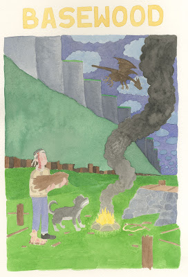
Basewood Cover Design: Part 9

Last week I showed how I used watercolor paint to try and color the finished inks for the cover of Basewood.  By the time I was done with it, I was not happy with how it turned out, and I considered the hours and hours that I spent on that version yet another mistake in this process.

Though it was painful to do so, I started over from scratch and re-colored the entire cover digitally.  Here are the results, which I am much more happy with:


At my publisher's request, I shrunk the title a bit, because this book is going to be big.  I also made the inner rings of the title brown to help the overall shape pop a  bunch more.  I also went back to my original sketch idea and dropped the monster down to a full silhouette.  

Little things still may change here or there, but at this point, I'm sick of talking about it!  Hopefully it was useful for people to see this entire process from start to finish.  If anyone would like to read Basewood, it is still available in minicomic form on my website.

Next week it's back to the 100 Watercolors challenge!

May 9, 2012

Basewood Cover Design: Part 8

Earlier in this design process I talked about being stressed out by the idea of having to add color to Basewood, something I had never done before.  While my early color sketches were a mistake in terms of trying to figure out the composition of the cover, they were useful in helping me figure out the colors for the cover.

I thought that digital color would look too cold and mechanical, so I decided to do the cover colors using watercolors, a decision I felt comfortable with mostly because of my recent experiments in the 100 watercolors challenge.  I found a beautiful piece of 300 lb. cold-press Arches watercolor paper left over from my Pratt days and used a lightbox to pencil in the key elements of the cover, at size.  Here's what the raw scan looks like:


While the Arches was wonderful to paint on, it turns out that it was a bit too thick, and my lightboxed penciling was not nearly as accurate as I hoped it would be.  When I brought the colors into Photoshop and placed them under the lineart, the alignment was not even close.


I used the Clone Stamp Tool to repaint the edges of the different watercolor regions to match the lineart.   For instance, in the photo above, the trees and cliffs have been corrected to fit the lineart, but the clouds are still untouched.  It took hours to get all of the colors to synch up with the lineart.  Here is what the cover looked like after I was done:


Needless to say, I was not pleased with these results.  I like the warmth of the various textures in the grass, sky and cliffs, but everything is much too bright and there are lots of issues with the values here.  So then I went in and make very careful selections for every single region of the drawing.  This also took hours.  Here is just a part of my "corrections" adjustment layers folder:


With these, I was able to adjust the lightness, saturation and hue of each isolated region.  Cat Garza did a coloring demo in one of my classes once using this method, which was the only way I knew this technique.  At the time, it looked to me like a crazy way to work with color... and after all this hassle, I think I still stand by that assessment!  I will not be using this technique again any time soon.


So here is the color corrected version, which I sent off to the good folks at L'employé du Moi.  And can you guess what they said, Dear Readers?  Of course you can!  And so, even though we all thought this was going to be the last post in this series, it looks like there will be at least one more next week!

May 2, 2012

Basewood Cover Design: Part 7

Last week we saw the pencils of my Basewood cover and this week I have the inked version, with some placeholder text dropped in using Photoshop.
If you haven't picked up on it yet, I have been showing every single step of this cover design process to help buy me some time at the end of a very busy semester at CCS.  Next week I will post the final cover design, which will get me through graduation.  After that, I'll have more time to whip up some "regular" posts.  

Also, thanks to everyone who swung by and said hi at MoCCA this weekend!

April 25, 2012

Basewood Cover Design: Part 6

Last week we saw the four designs that were chosen by my publisher and the tallied votes of my students.  Happily, the two opinions lined up almost exactly.  In the end, the final choice was mine, and even though the "Silhouette" design was the most popular, I decided to go with the "Fire" design instead.

I like the idea of seeing The Great Cliff as well as Basewood right on the cover.  It might not be as action packed, but I feel like it instantly conveys more about the story, and Ben's place in it.

Max encouraged me to do one more revision of the sketch however, to move some of the elements around, and, if possible, to include the dog.  He told me not to worry too much about it not being a "real" moment from the story.  He said, "It's nice to have a dog on the cover!"

I was so burned out at this point, it was really hard to make another sketch.  I kept moving elements around, but everything felt arbitrary.  I kept starting new sketches until eventually I had four going at once!


That one in the bottom right finally developed into the final sketch.  I taped it to my drawing board and sat with it for a few days, making little adjustments here and there.  Then, finally I penciled it.


Honestly, it was such a crazy process getting to this point, I can't even tell if I like this cover.  Going through so many steps really took a lot of wind out of my sail.  I can only hope that it is a stronger cover than my first early attempts, because those would have been the ones I went with as a self-publisher.  Anyway, it is what it is!  No turning back!  Next week I'll show you the inked version.

This weekend is the MoCCA Arts Fest in New York City!  I'll be at table M11 (along the back wall) with my good buddy Jon Chad. Claire and my sister Galen will also be there, so it should be a lot of fun.  If you are in the area, swing on by!  I'll have all five chapters of Basewood for sale, and a new Drop Target zine to boot!