Alec Illustration
Portfolio Books Coloring About Contact Blog

December 24, 2019

Picture Book Workshop!


Early in the new year I will be teaching a Picture Book Workshop in Santa Fe at Bee Hive Kids' Books. The class will meet on four consecutive Tuesdays, from 6-8pm: January 15th, 22nd, 29th and February 5th. This will give participants a week between each session to complete the homework. Each assignment builds upon the previous session's work, with a goal of creating a complete picture book manuscript and sample illustration by the end of the course.

I will be sharing my experiences working as a professional illustrator, creating picture books by myself and with authors, as well as tips for working in traditional publishing and how to self-publish your own picture books.

I taught a Children's Book Summer Workshop in 2012 at The Center for Cartoon Studies which was so much fun! Ever since, I've wanted to try it again, and now I've finally got the chance. You can sign up for the course over on the Bee Hive Writing Workshops webpage. Space is limited!

May 12, 2019

"It's Been So Long" Weezer Fan Club Exclusive 7"!

I recently had the honor of illustrating the jacket and label art for the 2019 Weezer Fan Club exclusive 7" record. The project was art directed by Karl Koch, the band's longtime archivist and "jack of all trades." Unlike some of my previous illustration projects with Weezer, I had plenty of time to work on this one, so I had a lot of fun loading the illustrations up with tons of detail. Below you can see some behind the scenes photos from my process. (You can click on any of these images to see them bigger!)

This is the third Weezer Fan Club exclusive 7" record, and it features a great track, It's Been So Long. Karl described it to me as a 2014, Everything Will Be Alright In The End-era b-side, similar in spirit to the Beach Boys song Do It Again. He asked that I try out ideas that were more abstract than just literal interpretations of the lyrics, and suggested an idea of the members of Weezer driving in their first tour van, Betsy.  Below, left, you can see my sketchbook page where I am trying to process all of this information, along with considering the previous fan club 7" record designs.


I thumbnailed about 30 ideas and the culled the best 15 to send to Karl. The one he liked best was a design from the point of view of Rivers driving Betsy through the desert at sunset (above, right). Once he had selected that front jacket design, I thumbnailed a back jacket design of the van broken down (which Betsy apparently did quite frequently).

This seemed appropriate, but there was a problem - the designs depict the band in 1994, when Matt Sharp was the bassist of Weezer, but "It's Been So Long" obviously features Scott Shriner, Weezer's current bass player. It didn't seem right that Matt should be on there, but not Scott, but it also felt wrong to leave Matt out of the history of this image. I then had the idea to have Scott driving by on the freeway, blissfully unaware of the small touring band broken down on the side of the road, which he would someday be a member of. All the guys were living in California at the time, so this could have happened! As the cartoonist Don Rosa often says in the notes of his historical fiction stories: "Prove that it didn't happen!"  :)

Karl set me up with a dozen reference photos of Betsey, the band, and various ephemera from that era, and then we both did a deep dive on Google Image Search for dashboard and interior photos of 1985 Dodge Prospectors (the van) and 1980 Dodge Challengers (Scott's car). Overall, 60 reference photos were used to ensure maximum accuracy.


I started with the front jacket illustration. Below you can see the in-progress pencils next to the finished illustration. When I'm working on something really detailed like this it helps me to use multiple lead colors (black, blue, red) to visually keep track of different parts of the image.


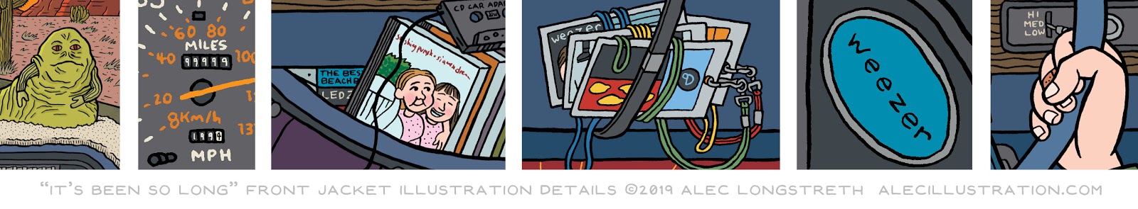
The image is loaded with "easter eggs": 1) In Karl's reference photos, there was a Jabba the Hutt action figure velcroed to the dashboard, which sat in a custom-cut piece of white carpet that lined the entire dashboard. 2) I set the odometer to 99,999 miles, so this illustration is taking place in that magic moment when you "turn over" the odometer back to 00,000. Also the trip odometer is set to 199.4 miles, to hint at the year of this tour. 3) The only lyric I directly lifted from the song was "It's been so long / since we put the Smashing Pumpkins on" by including their album Siamese Dream (released in 1993) on CD, plus a tape-adapter. There are also Beach Boys and Led Zeppelin tapes hiding in the back there. 4) Strapped to the visor are a collection of backstage pass laminates from this era of Weezer touring. The one seen in the front is from the band Lush, which Weezer opened for in the summer of 1994. 5) This is the first, really poor quality Weezer sticker that their label initially printed. They were just cheap paper stickers - the very first Weezer promotional "merch." 6) I remember vividly Rivers having a band-aid on his right middle finger the first time I saw them perform live, and he said it was from playing guitar every night. So I included that here. 7) I also drew Rivers's eyes a bit bigger than normal in the rearview mirror because it seems like in all the photographs from that era his glasses lenses were really thick, and his eyes always seem a bit enlarged.


Instead of pencils for the back jacket art, I thought I'd include the digital sketch that I mocked up in Photoshop, which shows how I modify the reference photos to make sure their perspectives are both heading towards the same vanishing points. Then I print that out and use a lightbox to trace it onto a piece of bristol board. In this image Karl and Pat are trying to fix the engine, Rivers is noodling on his guitar, Brian and Matt are playing hacky sack (a nod to the Say It Ain't So video) and Scott is serenely cruising by. Every detail of this image is meticulously researched, from the outfits and shoes to haircuts, tattoos, etc. My only liberty was giving Scott the license plate "SGS 711" which I'm not sure if he had or not back then, but thought he would appreciate now.


If it had all ended there, this would have been the coolest illustration gig of my life, but then I also got to design and illustrate the labels for the 7" vinyl record! In the first "thumbnail" image you can see some of the ideas I pitched Karl for the A and B sides of the label. In the end, we decided to pull circular elements directly from the car, but replace the lettering to give information about the song. It was interesting trying to evenly distribute lettering and other design elements radially.  The A side label was one of Betsy's tires, with the lettering "Remington Wide Brute" replaced with the band's name and the song title, matching the style of type.


For the B side label I redrew the speedometer and odometer from Betsy's dashboard. The "miles" were set to "WFC003" (to mark that this was the third Weezer Fan Club release) and the trip odometer was set to 201.8 miles because I drew this in 2018 and I thought it would be released that year, but it was delayed for various unknown reasons. Also, the little blue light that turns on when you activate your "brights" has a little Weezer logo in it, instead of the lightbulb icon. I sent these files off to the printer and a few months later, Karl sent me a copy in the mail. It was only then that I found out the track had been printed on "Weezer Blue" vinyl!! <3 p="">


This is, without a doubt, the coolest illustration project I've ever worked on! Thanks so much to Karl Koch for hiring me to illustrate this, and I hope all the fan club members appreciate the time, energy, and love that I poured into these drawings.  If you would like to get a copy of this record, there's only one way to do that - sign up for the Weezer Fan Club and purchase a 2019 fan club bundle, which includes the 7" record along with some other exclusive items. It's a really exciting time to be in the fan club, with the band releasing new music, touring a lot, etc. etc. etc.  =w= 4 eva!!!

April 3, 2019

Weezine Omnibus: Deluxe Edition

As I mentioned in my previous post about the Weezine Omnibus, some of the photocopied images in my original printings of the zines were not great quality. When I asked for replacements, Karl Koch went deep into the weezer archives and scanned and sent me higher quality images, but they weren't just better scans from the zines, they were actually full color scans of the original paste-up assets used to CREATE the zines (!!!?!??!?!?!).

For example, here is the actual "weezine" logo, which was created with print outs, tape, collage, gluestick, and rubber cement, which was used for every issue of the weezine.


It never occurred to me that Karl had saved all of these assets for all of the zines (but of course he did, that's why he's Karl!). It was incredibly exciting, but I did my best to keep my head down and finish the original omnibus. In the back of my brain however, a plan started brewing...

Once the $15.00, 300-page, black and white edition was done, I pitched the idea of doing an oversized, full color "Deluxe Edition" of the omnibus to Karl, which he agreed to work on with me.  It started with the simple idea of reprinting those same 14 issues in full color, but grew into a much larger project...

For the cover, I tried to recreate a cutting mat workstation that Mykel and Carli might have used to create the original zines. Mixed in with various photos, flyers, stickers, fan club card assets and secret surprises were also some of the tools of the zine trade, pre-desktop publishing. I put in scissors, a glue stick, an exacto blade, and some white-out (all in Weezer Blue, naturally) and added a bit of a drop shadow, to try and make this stuff feel a bit 3D, in comparison to the other "flat" items.


I chose an 8.5" x 11" trim size for the book so that the 5.5" x 8.5" zine layouts could be presented at full size. This was nice, because (for most of the zines) it meant healthy margins on all sides.  This was the first time I ever put page numbers in the top margin of the book, which also bought me some room to individually label each page with what was being displayed below.

In the "standard" omnibus, the goal was to clean up the art, so that it was as legible and clear as possible, which meant hundreds of hours going through every single page and cleaning things up in Photoshop. In the "deluxe" edition I did no photo editing whatsoever, because even the smallest tweak of curves or levels would wipe out the white-on-white-on-white of print outs, tape and white-out.


I went through and laid out pretty much the same 300 pages that are in the "standard" edition, and that's when Karl decided to really take things up to the next level. Since it was print-on-demand, we were freed from worrying about page count, and since we had already made every effort to make sure fanclubbers could get the original info from the zines in an affordable $15 edition, we decided to really make this book really special.  

Karl dug deep into the weezer archives and pulled out a ton of assets that Mykel and Carli originally used to organize and run the fan club. Karl also wrote a long introduction, and anywhere something was referenced (for example a fan club T-shirt design contest) he actually went into the archives, found those items, photographed them, and then annotated the entry in the book.


Below, you can see Karl's annotations running underneath the zine layout. The book ended up being 400 pages, so there is an extra 100 pages of bonus content in here, all heavily annotated by Karl. One of my favorite additions were a couple of spreads in between each issue, which featured all of the fan club card photos for members (I'm pictured in the lower half below, second row down from the top, all the way on the right side - #2660!!!)


Karl even wrote a (heartbreaking) account of Mykel and Carli's death on tour with the band in 1997, and what it was like, trying to keep the fan club going in the aftermath of that tragedy. He included a bunch of assets from some of the other fan clubs that Mykel and Carli ran, and talked about what might have been, had we not lost them too soon.


As with the standard omnibus, this book is only available to current members of the Weezer Fan Club! You can currently sign up to join the fan club, which just launched a cool new app with lots of neat features. This is a big, full color, expensive book ($94.96... get it? ;) for only the most hardcore fans. It was a labor of love for Karl and I, and as with the standard omnibus, all proceeds go back into the costs of keeping the fan club going.  I hope Mykel and Carli would be proud of it! 

Below you can see a video preview of this book, to give you an idea of its splendor!


I've got one more weezer post planned, about the 7" fan club exclusive single that I recently illustrated for the band. I'm just waiting for the first copies to arrive at fanclubbers' houses first, so I don't ruin any surprises!  The only way to get this 7" is to sign up for the current fan club membership pack. More about that in my next post!

March 27, 2019

Weezine Omnibus

As I thoroughly documented in my book Weezer Fan: Phase 7 #017-#019, I have been a superfan of the band Weezer since their early days, and have even been lucky enough to create some official merch for them, including tour posters and T-shirt designs.


I joined the weezer fan club in 1996, which was originally run by sisters Mykel and Carli Allan. One of the coolest things about the fan club was that a couple of times a year Mykel and Carli would mail out issues of the weezer fan club zine, weezine. Not only were these packed with tons of fun information about the band, upcoming releases, dispatches from the tour (the original Karl's Corner!), and drawings/photos from various fan club members, it was also my first exposure to self-published zine culture!

Over the years, I managed to assemble a complete run of the zines by taking advantage of occasional offers to sell off remaining copies of back issues, offered by Karl Koch when he took over fan club operations after Mykel and Carli tragically died in a car crash while on tour with the band in the summer of 1997.


In 2014, the weezer fan club was relaunched, just before the release of the band's ninth studio album Everything Will Be Alright In The End. I (of course) joined the current iteration of the fan club, which mostly takes place in a private Facebook group. It was really fun to reconnect with the fan community of this band that I love! One day however, a strange thing happened... 

Someone had the idea to start a document trying to list all of our fan club numbers. "Old" members like myself got to keep our original numbers, with new 2014 members picking up with new numbers where the old numbers left off, somewhere in the 4000s.  I jumped into the document and filled in "0001 - Mykel Allan" and "0002 - Carli Allan" because, as all old fan club members know, Mykel and Carli were the very first weezer fans, and had these most-holy of numbers on their cards.  A new member made a comment to the effect of "Whoa, whoa! Who filled in #1 and #2? Is that a joke? Who are these people?" and it hit me that a lot of the new people had no idea about the history of the fan club that they were now a part of.

I pitched the idea of creating a print-on-demand, perfect bound book that would collect all of the original weezines to Karl, and he immediately okayed the project, and offered to help out anywhere he could. In the end, the book was over 300 pages, and it not only reprinted all of the zines, but also included scans of the original fan club application form, press packets, signed 8" x 10" photos of the band, lyric sheets, stickers, and photos of the various "secret surprises" sent out over the years.


Above you can see the cover design, which utilizes classic "Weezer Blue" along with all of the cover images. Karl gave me the official weezer font, which I used throughout the design of the book. I had to reformat a few spreads from the zines to fit the 5.5" x 8.5" format (some of the later issues were printed on 11" x 17" paper that folded down to standard half-letter zine size) and I meticulously went through and tried to present the best possible image quality, where my copies of the zines had either not great printing, or had been damaged in the mail.


Below you can see a preview video that I created to give fan club members an idea of what the Weezine Omnibus looks/feels like. This book is only available to current members of the Weezer Fan Club! You can currently sign up to join the fan club, which just launched a cool new app with lots of neat features. The omnibus can be found in the fan club members-only shop in the app, and it costs $15.


If you can believe it, this is only the beginning of this rad project! In part two I'll give you a look at the Weezine Omnibus: Deluxe Edition!

March 20, 2019

SFTBW Alumni Album Covers

Back in 2014 I produced a rock opera reinterpretation of my graphic novel Basewood, called Songs From the Basewood.  My amazingly talented friend Andy Hentz did 99% of the work, including singing the part of the main character, Ben. I co-wrote some of the songs and got to sing the part of the wolf-dragon, which was a ton of fun. For the other three parts, we contacted some of our very talented musician friends who we met in college. My friend Lindsay Sharp sang the parts of Violet and Caren, Ben Montgomery sang the part of Argus and played all of the trumpet parts, and Sudara Williams sang the part of the dog, contributed some beautiful guitar parts and also mixed and mastered the entire album.

Making Songs From the Basewood was one of the most incredible creative experiences of my life, and I'm so proud of what our team created.  Sometimes I feel like I actually like the album more than the book! Anyways, this is all to say that I've stayed in touch with all these incredibly talented musicians and have recently had the opportunity to create some cover art for their recent albums!

Wurlibird Special by Sudara Williams


Sudara performed this entire instrumental album on a Wurlitzer organ and he had a really clear vision of what he wanted for this cover image.  It was just a matter of trying to deliver what he was envisioning in his mind.  A couple of sketches, a few value tweaks and we let this cover take flight!

Free As a Hotel by Ben Montgomery

The story of this album is a long one, so without going into its whole history, I'll just say that I got very slightly involved with it in a motivational capacity in the 11th hour.  I think because of my minuscule role in bringing about its completion, Ben and Sudara (who mixed and mastered the album) asked me to make the cover art. All of the songs were written in Ben's apartment, at his piano, and luckily for me, he lives just down the road here in Santa Fe. I swung by and took some photos and then worked up some sketches to send to Sudara who art directed this piece.

Originally he asked for a "messy" treatment (maybe with charcoal?) and even as the idea developed further, that sort of got stuck it my head.  I took a first crack at the approved sketch using cold press watercolor paper, ink wash and a soft blackwing pencil. 


This image felt too dark for these tunes, so before abandoning it completely, I messed around with the grayscale image in Photoshop, using the "duotone" process, which essentially replaces the white and black ends of a grayscale spectrum with two other colors. It was really fun to experiment with different color combinations. This lightened up the image, but it still didn't feel quite right.  I may come back to this technique again for some future project!

In the end, Sudara asked for a more "Alec" style of rendering, in full color, for the finished piece :)


As you can see, I implemented some of the textured photoshop brushes that I learned how to use on Be Prepared.

Both of these albums are really great, so I hope you'll follow the links above to stream them for free, or consider buying them on the platform of your choice!

March 4, 2019

Introduction to Hand-Drawn Animation Logo

This summer I will be teaching the Introduction to Hand-Drawn Animation workshop at The Center for Cartoon Studies in White River Junction, Vermont.  The class runs July 8-12 and is open to students 16 years and older.

I recently animated a new logo for the class, which seemed like a simple way to showcase some of the techniques and principles covered in the curriculum.  My hope is that potential students will watch this animated logo and go "That's what I want to be able to do!" and then come study with me in Vermont!  :)

Here is the finished logo, which loops every 24 seconds, and below you can see some steps of my process for putting this together:


The very first step was hand lettering all of the typography:


I then cleaned these up in the computer, and combined them with the CCS logo and the bouncing ball path, which I had on hand from a previous logo design.  I printed this out and then three-hole punched it on the top and bottom edges, to keep all of my animations registered to this design.


I decided to animate each section as its own "scene," starting with the little CCS person walking in and getting bonked on the head by the ball, which turns into the iconic speech balloon shape and makes them spill some ink.  I set up a 16-frame walk cycle that would loop three times to get the character across the screen.  Here's my thumbnail document to figure all of that out:


I animated this all on paper. Last year my old pal Nate Beaty gave me the idea of using stop motion animation software to create quick and easy pencil tests.  I downloaded Stop Motion Studio on my iPad and set it up on a tripod over a pegbar, like this:


I shot a couple of tests, made some corrections and then scanned in all my pencils for the little CCS person.  I then "inked" it in Photoshop, drawing on a wacom tablet, on a new layer directly over the pencils.  This worked well, because it allowed me to easily tweak small things, like the swaying brush end.  Here is an early pass (I later thickened up the ball path outlines):


Next up I did the "Animation" lettering, following the same process.  Here is a pencil test, before I inked it in Photoshop:
The last three "scenes" were all animated directly in the computer.  For the cursive "Introduction to" I simply saved a selection of the text and then filled in a bit more of the selection for each frame.  I decided to animate this on 1s (24 drawings per second) so that it would be really slow and smooth - it's how I write cursive, which takes a lot of concentration for me, and also kind of reflects the idea of an "introduction" to something - slow and steady.  It ended up being 287 frames, or a little under 12 seconds:


For "HAND-DRAWN" I wanted something really messy and organic to help emphasize that it was done by hand.  I followed a similar process of selecting the finished letterforms, and then I just did a series of straight ahead passes, improvising each frame with a series of squiggly lines that build and overlap and eventually fill in.  I wasn't 100% happy with how it turned out -- it would have been fun to also do this on 1s, where each squiggle actually moved along perfectly -- but by the end of 57 frames of this, I didn't have the energy left to take another crack at it!


I went through a lot of different ideas about how to loop the animation back to the beginning, but finally decided on a "circle wipe" using the center dividing line.  I did this all in Photoshop, just using Edit > Free Transform and then putting in a series of degree measurements that added up to 360 (making sure to ease in and out) for rotation.  I then painted white pixels very carefully into the scene while preserving transparency, to reveal or cover up parts of the scene as needed.  If you understand transparency in Photoshop, this will give you an idea of how that worked:


Once I had all these elements prepared as Photoshop documents with one frame on each layer, I brought them into Moho Pro and set everything up as its own individual switch layer. This allowed me to toggle on one layer at a time, which was essential because I was mixing animations that were both on 1s and 2s.  It also made it easy to position everything on the screen and on the timeline, to make sure things began and ended when I wanted them to.  Also with one click I could easily export .mov and .gif files. Here's what that looked like:


Anyway, I was pleased with the end result.  It didn't end up perfect (of course), but it was a lot of fun to put together, and I learned a couple of things along the way.  If this process looks fun to you, consider signing up for my Introduction to Hand-Drawn Animation class at CCS this summer!  It is going to be a ton of fun, and you can see some past student work on the workshop page.

February 13, 2019

Night is Nigh by Galen Longstreth

In my last post I talked about how I first learned to use textured photoshop brushes while coloring Vera Brosgol's Be Prepared.  After finishing that project, I was very excited to try out these new techniques on my next full color project, Night is Nigh, a picture book written by my sister Galen which I illustrated.

The main thing I used the textured brushes for was highlights on various surfaces (for instance the face of the boy holding the flashlight shown below).  To help highlight this technique, I also decided to use the same textured brush to create a rough edge around each illustration in the book:

Since the entire book takes place at night, I also experimented with putting a multiplied layer of blue over the entire image and then using different values in the layer mask to show or hide the blue to varying degrees. Wherever these "lighting" highlights/shadows appeared, I also used the textured brush which gave a nice soft edge to these effects.  Here you can see an illustration next to its layer mask information (on the characters only - backgrounds were on their own layer). The darker the gray, the less blue is applied, the lighter the gray, the more blue is applied: 


One last area of experimentation for me on this book was setting up my print files using a higher resolution Black plate (in this case 600 dpi) with lower resolution Cyan, Magenta and Yellow plates (300 dpi), and then combining them in InDesign.  The final printed book had really nice, crisp lineart!  This was all a good test run for the first Isle of Elsi book which I will be laying out soon.


As you can tell, I learned a lot by coloring this book!  Below are some of my favorite spreads:
You can find ordering information for Night is Nigh on this page, including a link to a free eBook version!  It's a fun bedtime story about camp.

February 6, 2019

Be Prepared by Vera Brosgol

Vera colored the cover, not me!
Amazingly, Walker Bean 2 was not the only graphic novel released in 2018 that I colored. The other was Be Prepared by Vera Brosgol!

Now, I turn down a lot of coloring work. When you color someone's book you spend hundreds of hours looking at every line of their cartooning under a microscope. The only way I can enjoy that process is if the cartoonist in question is a lot better than me, and if it's a story I'm really excited about.

Also digital coloring is work-for-hire (paid once, no royalties on translations/reprints), a type of work I do as little of as I can afford to these days. James Sturm had a great piece of advice for my professional practices students at CCS: "Define 'reward' broadly" which definitely applies to my approach for coloring projects.  I work a day job to provide a consistent income for my family, and also so that I have the freedom to take on freelance projects that I really believe in, instead of doing them just for the money.

When Vera asked me to color her book I leapt at the chance, for three non-monetary reasons:
1) I have long-admired Vera's cartooning, especially her first book Anya's Ghost.  I read her pencil draft of Be Prepared and was floored by the story, the characters and the drawings. I instantly wanted to be a part of the project.
2) The book was going to be colored with just three colors (black, a light green, and a dark green made by mixing the light green and black). I had never used such a limited palette before, and it seemed like an interesting challenge.
3) In the samples Vera sent me she was using textured photoshop brushes to apply the color, which is something I had wanted to experiment with, but had never found an opportunity to do so.

Getting to work with a cartoonist I admire, trying a new style of coloring and learning some new skills all made this a project that I was very excited to take on.  It was a tight deadline - I colored 3-4 pages a day, seven days a week, for a little over three months, but we got it in on time.


It was super fun working with Vera - she comes from a background in the highly-collaborative field of animation, so we often passed the files back and forth to try out different iterations, especially in the beginning when I was trying to lock in the style she was looking for.  Even when I got the final printed book, there were many small tweaks where Vera had put some extra polish on certain panels, which all looked great.

Anyway, below are some of my favorite spreads from this project (note that the files I colored never had any text in them!).  If you haven't already, buy a copy, or request it at your local library! It's such a great book and it was an honor to be involved with its creation!


I'm happy to say that I'm currently signed up to color Vera's next book, Plain Jane, which is going to be in full color!

January 30, 2019

Blog Archive Posts 2013-2018

Three years ago, just before my daughter Suzanne was born, I built a new illustration portfolio website because I wasn't sure when I would have a chance to update things again for a few years.  Initially, I shuttered this illustration blog, because I knew I wouldn't have time to write new posts, but last year I brought it back so that I can talk about projects I have been working on that might not necessarily make it into my portfolio.

I thought an appropriate series of illustrations to kick off this process of looking through old work would be the backlog of blog archive images from my personal website because these also show what has been going on in my life.  I do one of these a year, and it looks like the last one I posted in here was from 2012.  So now let's roll back through the sands of time to see what happened from 2013-2018.

In 2013 my girlfriend Claire was diagnosed with papillary thyroid cancer.  This was (obviously) a really big deal, so it seemed like the right choice for this image.  The good news is that Claire's treatment went very well, and it gave us an excuse to finally get married!


To pay for Claire's medical bills, I took on my biggest illustration project ever, Middle School: Ultimate Showdown by James Patterson. This meant putting all my personal comics projects on hold, however, including Basewood which I had just finished.  When Claire's treatment was done and all the bills were paid, I finally set up a Kickstarter which helped me self-publish my book. In the small press world, you only have one year while your book is "new" so I spent most of 2014 on the road, exhibiting at 14 comic shows all around the country and abroad, which was exhausting.


I was so burned out by the end of 2014, I decided to take a year off from exhibiting at any comic conventions.  We also found out in 2015 that Claire was pregnant, so it was a year of really buckling down and trying to work ahead on projects. One of my main goals was to build up a buffer of pages for my webcomic Isle of Elsi, which launched at the end of that year.  We also moved to Santa Fe, New Mexico, so that is subtly reflected in the stucco walls and tile floors shown here.


My daughter Suzanne was born in January of 2016.  The rest of the year was sort of a blur, so I just drew us on the night we brought her home and everything changed.


I remember having a lot of difficulty coming up with an image for 2017.  Suzanne grew so much that year, it was hard to decide on just one image that communicated that whole experience.  In the end, I decided to build the image around the chickens we got that year (which had been a dream of mine for many years). Suzanne and I spent a lot of time that year sitting on buckets and looking at them and talking about them, so it seemed like a fitting image.


And then in 2018 my second daughter, Wendy, was born.  I decided to draw an image similar to the one from the year Suzanne was born.  Here we are as a whole family -- Suzanne a little wary, and Claire and I both very, very tired -- which is how 2018 felt.


It is worth noting that in the blog archives you can see that I was writing fewer and fewer blog posts as all these big life changes were happening.  These were often drawn on December 30th or 31st, right at the buzzer for each year, when it's possible to look back over everything that happened.  Maybe this year "the moment" will be clearer and I'll get this done before the very end of the year!

January 23, 2019

CCS Illustrations - Part 3: One-Week Cartooning Workout GIFs

In last week's post, I talked about developing the One-Week Cartooning Workout, a free email course with tips, tricks, exercises, examples and resources, with James Sturm for The Center for Cartoon Studies.  In addition to those spot illustrations which branded the course, I also designed a series of animated GIFs which demonstrated exercises or helped illustrate some of the concepts.

Day One - Four Panel Comic

The idea here was that you could draw your four-panel comic one panel at a time in linear sequence, or you could start by drawing the first and fourth panels and then fill in the middle two panels afterwards.

Day Two - Character Design

The goal for this exercise is to create two characters who are visually unique, but also speak with their own unique voices.  Starting with two different shapes is a great way to end up with two different character silhouettes.

Day Three - Thrice-Told Tales

A rule of thumb that I use when I am hunting around for a story to draw as a comic, is if I've verbally told a story at least three times (to friends/family/coworkers, etc.) than it is probably pretty entertaining, and I've had a chance to revise it through each retelling.  The goal here was to convey that idea and then use one such story as a writing prompt.

Day Four - Notecard Comics

James Sturm often uses blank notecards as panel templates.  It's a great technique because it is easy to rearrange the moments, or throw one out if you get a better idea, etc.  The goal was to demonstrate this way of working.

Day Five - Twenty-Four Panel Page Layouts

After the students script out comic story using 24 note cards, they are then prompted to turn that into a comic.  This GIF shows how 24 panels can be split up into a variety of layouts, which will have different densities and page counts.  It would work as a static graphic, but having each layout appear gives the viewer a moment to consider the layout.

Day Six - Draw Comics EVERY Day

Any success I've achieved as a cartoonist can be traced back to my practice of Drawing Comics EVERY Day, even if it's only for 15 minutes a day.  Again, this would work as a static image, but having each check mark tick off gives a stronger sense of sequence and time moving forward.

Day Seven - Seeking Feedback

This GIF communicates the importance of sharing your work (whether in person or online) and seeking constructive feedback.

If these exercises and concepts sound interesting, you can sign up for the One-Week Cartooning Workout at any time and it is absolutely free.  It's full of tips and tricks and examples and resources to help you get the ball rolling with your cartooning - check it out!