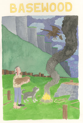
I thought that digital color would look too cold and mechanical, so I decided to do the cover colors using watercolors, a decision I felt comfortable with mostly because of my recent experiments in the 100 watercolors challenge. I found a beautiful piece of 300 lb. cold-press Arches watercolor paper left over from my Pratt days and used a lightbox to pencil in the key elements of the cover, at size. Here's what the raw scan looks like:
While the Arches was wonderful to paint on, it turns out that it was a bit too thick, and my lightboxed penciling was not nearly as accurate as I hoped it would be. When I brought the colors into Photoshop and placed them under the lineart, the alignment was not even close.
I used the Clone Stamp Tool to repaint the edges of the different watercolor regions to match the lineart. For instance, in the photo above, the trees and cliffs have been corrected to fit the lineart, but the clouds are still untouched. It took hours to get all of the colors to synch up with the lineart. Here is what the cover looked like after I was done:
Needless to say, I was not pleased with these results. I like the warmth of the various textures in the grass, sky and cliffs, but everything is much too bright and there are lots of issues with the values here. So then I went in and make very careful selections for every single region of the drawing. This also took hours. Here is just a part of my "corrections" adjustment layers folder:
With these, I was able to adjust the lightness, saturation and hue of each isolated region. Cat Garza did a coloring demo in one of my classes once using this method, which was the only way I knew this technique. At the time, it looked to me like a crazy way to work with color... and after all this hassle, I think I still stand by that assessment! I will not be using this technique again any time soon.
So here is the color corrected version, which I sent off to the good folks at L'employé du Moi. And can you guess what they said, Dear Readers? Of course you can! And so, even though we all thought this was going to be the last post in this series, it looks like there will be at least one more next week!


No comments:
Post a Comment